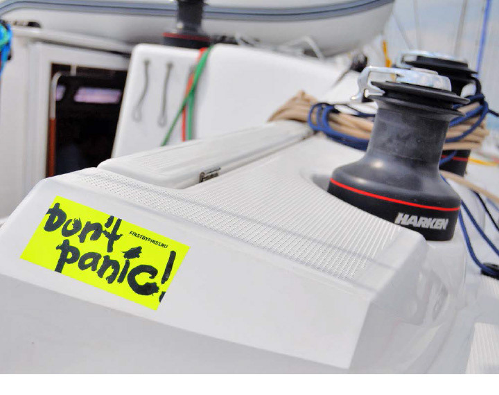
Again FirstByFirst’04. Again, the same childish excitement, a bunch of friends, whisky, game of dice, sailing races, pirates, grottoes, treasure troves, - however, this time, the ocean did not throw huge coconuts to the white sand beach. And WOWHOUSE for the fourth time developed the regatta’s brand identity.

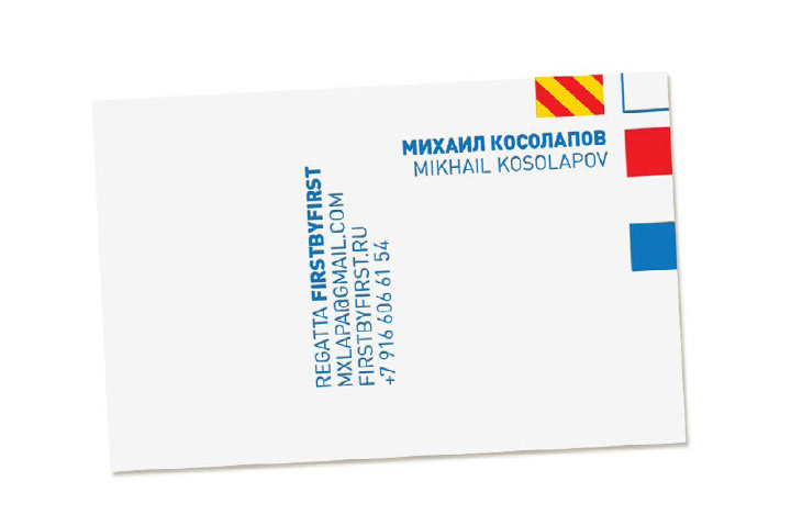
Member’s Certificate. Colored signs are the naval alphabet. For seamen, it is easier to read familiar little flags than Latin letters. See for yourself, what is more discernible at a distance of three cables.


Medal. The number of holes corresponds to the place; for instance, here you can see a 3rd place medal. The medal design this year is more complicated. Like the logo, it can be read only by a real seaman: little square refers to the letter F, a little flag, to the letter B. So, it reads: FBF.


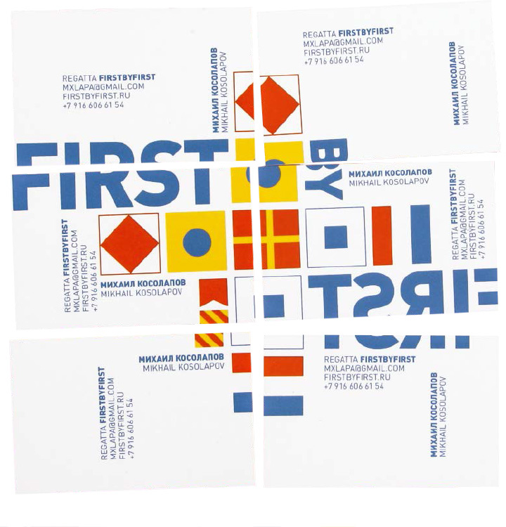
The organizers’ cards. They all are good, but we like the most the one in the lower left corner.